Little Scouts
Little Scouts is a mobile entertainment app used to perform scavenger hunts in local towns or cities.
It is designed for both young and older adults who want to feel connected outdoors either with themselves, friends, family, or their community.
Little Scouts came to life as part of my UX Design course at CareerFoundry.
My goal for this project was to create an enjoyable experience by designing a scavenger hunt app that was easy to use, understand, and fun to come back to.
- UX Researcher
- UX/UI Designer
- AdobeXD
- Adobe Photoshop
- UsabilityHub
- OptimalSort
Process
Methodology

1 – Empathizing
Problem Statement
People need an interactive way to explore their community while potentially meeting
other folks because they want to feel connected outdoors and learn more about locations in their city.
We will know this to be true when we see how many people are using our app as a sociable way to
build familiarity with new locations based on active users, reviews, and feedback.
Potential Solution for this?
An app that will allow people to create scavenger hunts in their city to familiarize themselves with new places. The app encourages people to go outside with an intuitive design that is structured in a way to comfortably guide any person whether they're taking on the role of hosting or being a member of a hunt.
2 – Defining
User Research
I needed to find out more about my potential users, so I conducted four user interviews with the following research goals in mind:
- Collect information on the context in which users would want to use a scavenger hunt app
- Determine what features users would find useful in a scavenger hunt app
- Identify comfort level of users with using this type of app
With all this info...
—It's time for Analysis
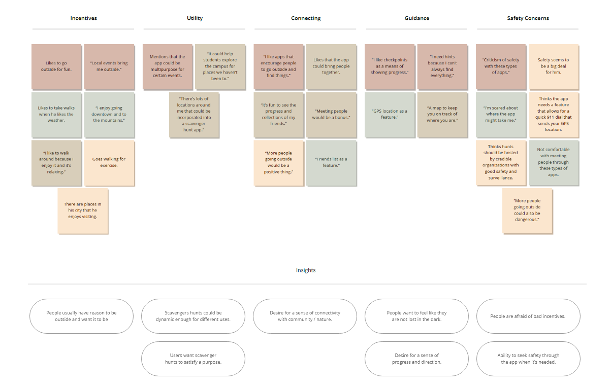
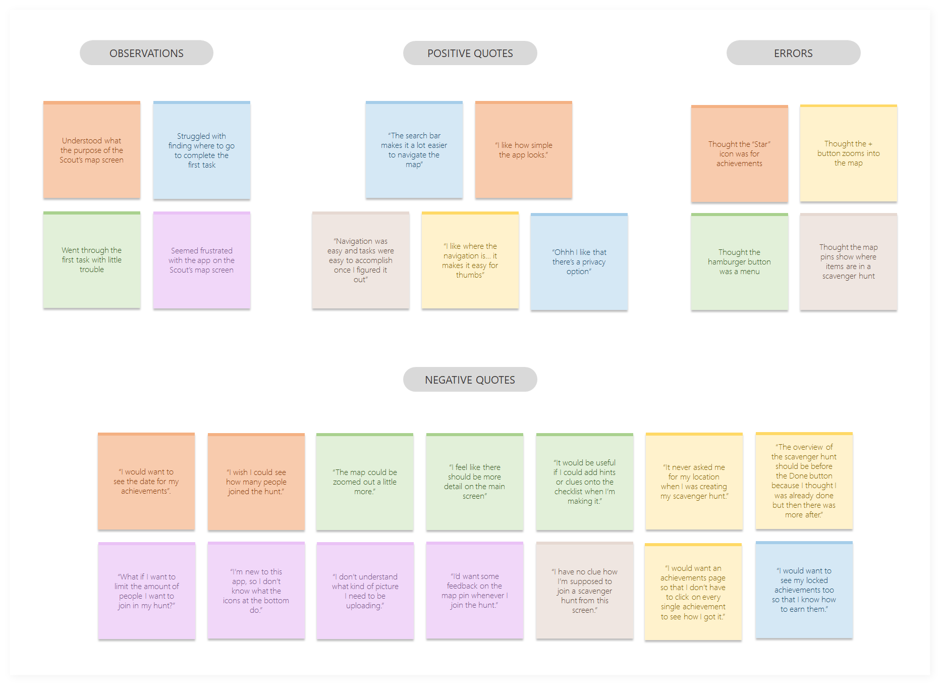
I performed an affinity mapping to explore my findings. Visually mapping out these relationships and themes helped me to better understand the thoughts gathered from my participants. Insights were then deduced from the groupings.
User Personas
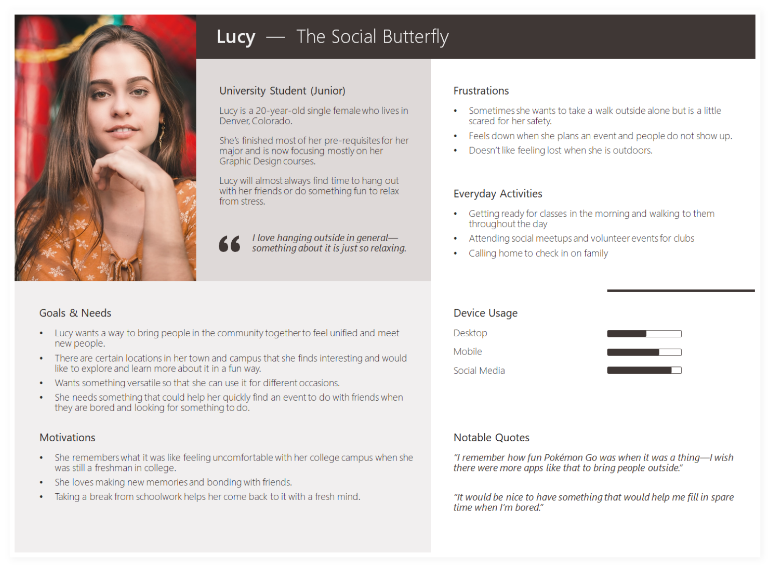
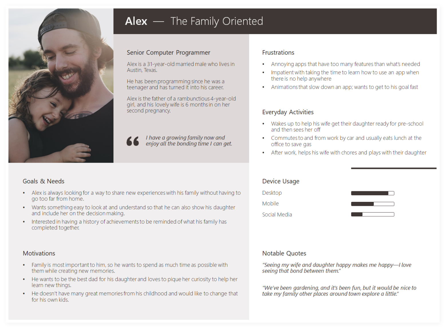
And with that (research & analysis), two primary personas emerged. Lucy, a social butterfly, and Alex, a family-oriented person, help to capture the behaviors, needs, goals, and frustrations of our potential audience.
3 – Ideating
At this point, it was time to start visualizing the process our personas need to go through to accomplish their goals.
For this project, we were to focus on three core features/processes.
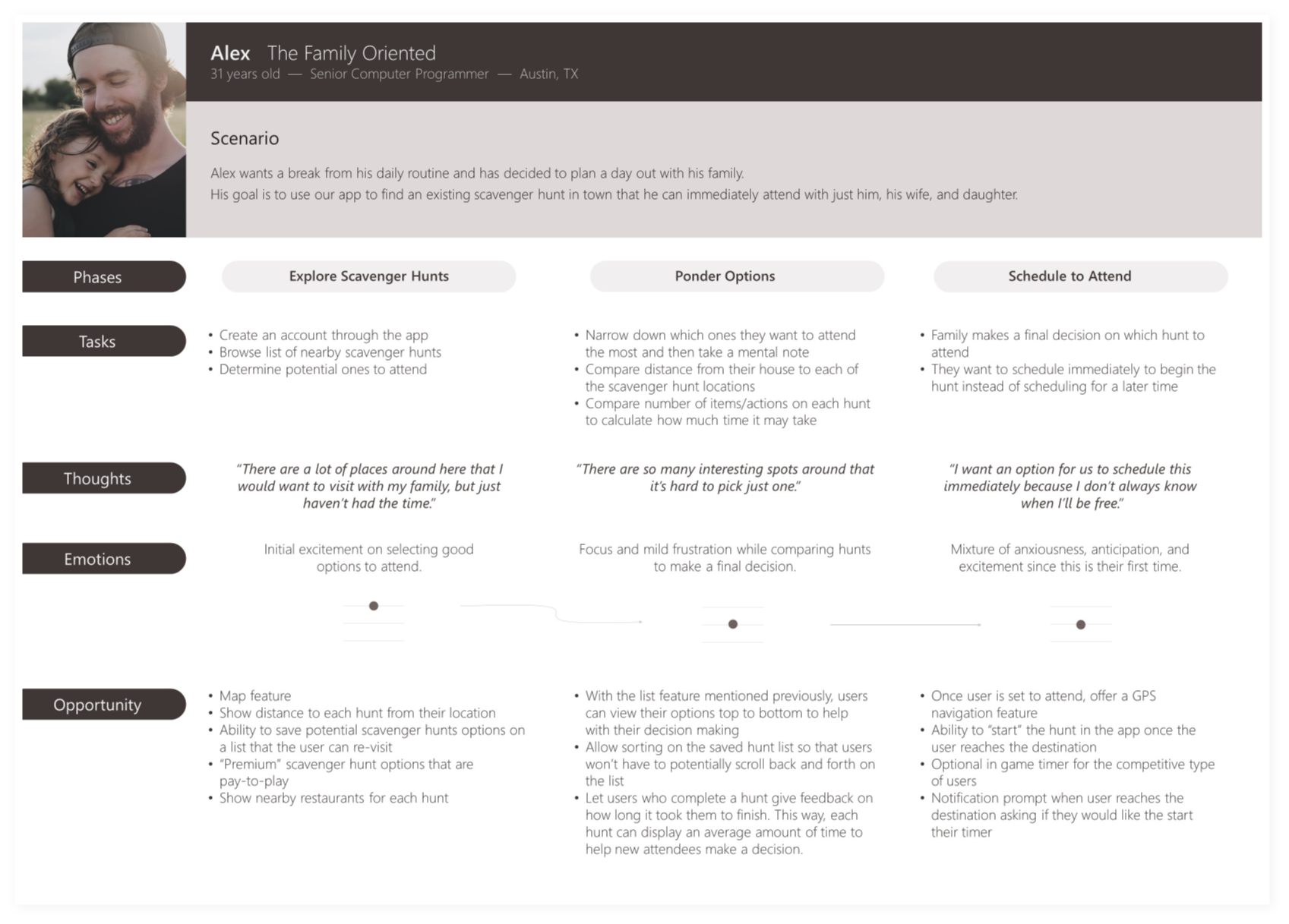
User Journey Maps were created to communicate a narrative that would make their process more personable and memorable.
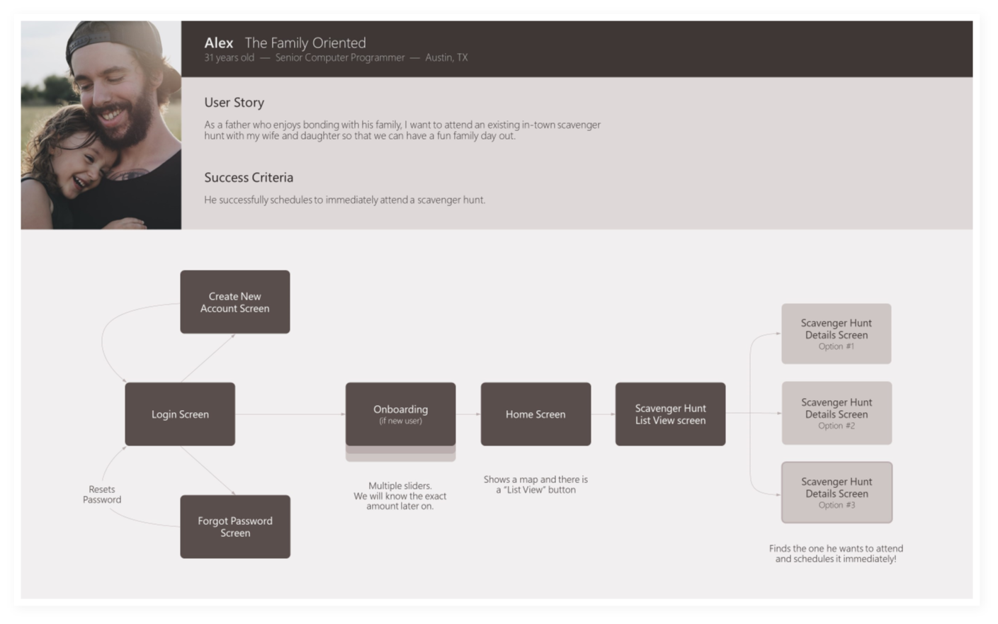
User stories were then mapped out in a User Flow so that I could see each individual action that would need to be taken.
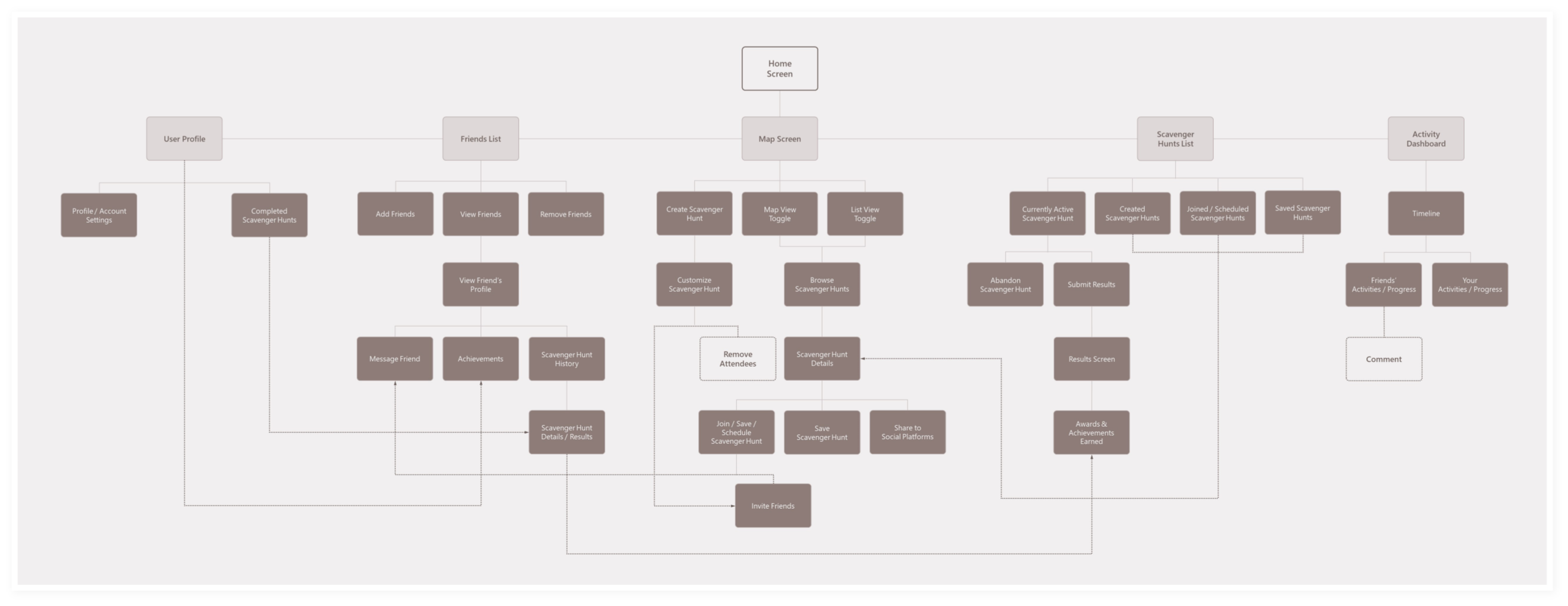
Afterward, I crafted a Sitemap based on what was learned so far and then refined it by conducting a card sorting via OptimalSort.
Journey Map
User Flow
Sitemap
4 – Prototyping
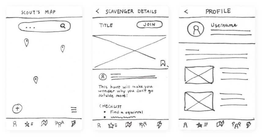
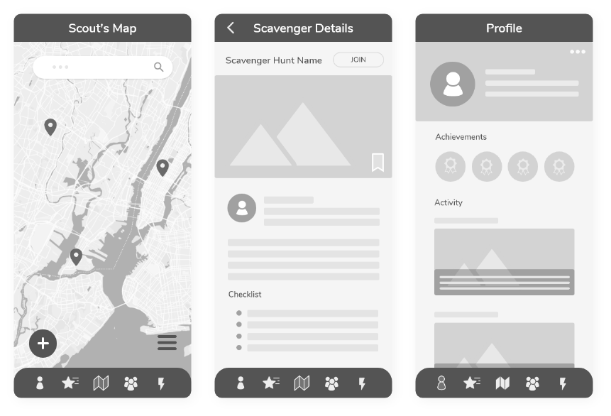
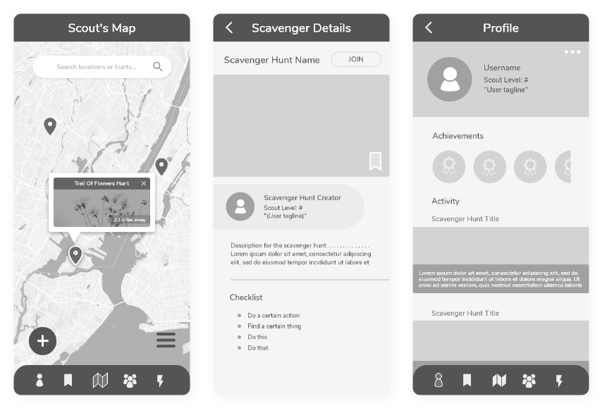
Now that the features were outlined, I began to sketch and experiment with each wireframe on paper. These were then transformed to low-fidelity and then up to high-fidelity prototypes using Adobe XD.
Low-Fidelity
Medium-Fidelity
High-Fidelity
5 – Testing
Usability Testing
Using my high-fidelity prototypes, I conducted usability tests with six participants that fit within our targeted demographic
for Little Scouts. Due to COVID-19 restrictions at the time, sessions were held as moderated remote tests using Adobe XD's
share link and built-in screenshare via Skype.
The goal of this study was to assess learnability for new users who were interacting with the app for the first time.
I wanted to observe and measure whether users understand the app and were able to navigate through three of its core features.
 Participants: 6
Objectives
- Determine whether participants can successfully navigate through three core features of the app.
- Observe any issues with the current design that may cause pain points for the user
 Session Time: 15 mins
Tasks
- Join a nearby scavenger hunt that you’ll schedule for a later date.
- Create your own scavenger hunt for others to enjoy.
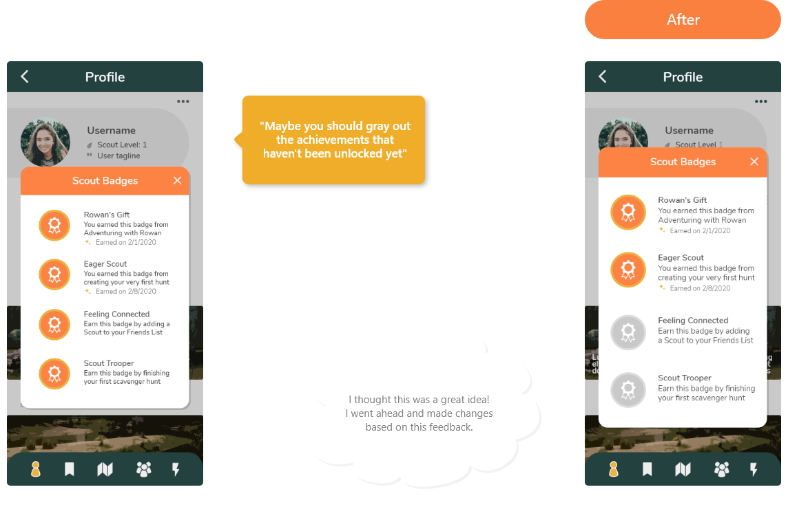
- View your accomplishments and how you earned them.
More Affinity Mapping!
I gathered all the feedback from the usability tests, created another Affinity Mapping and then also created a Rainbow Spreadsheet to look at the issues from a more organized, wholistic perspective.
Main Issues
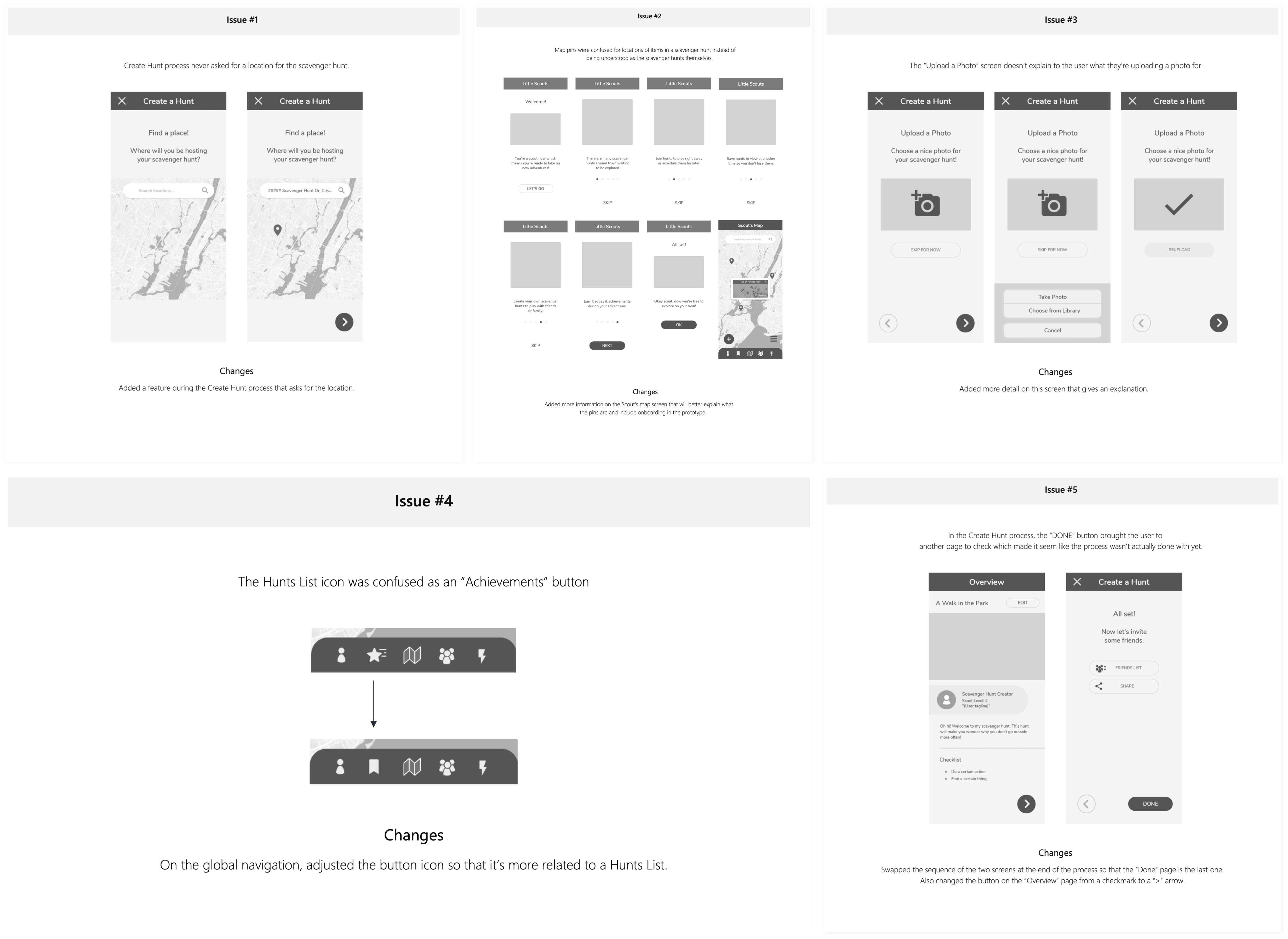
Analysis of the results helped me pick five main issues to improve on:
- Create Hunt process never asked for a location for the scavenger hunt.
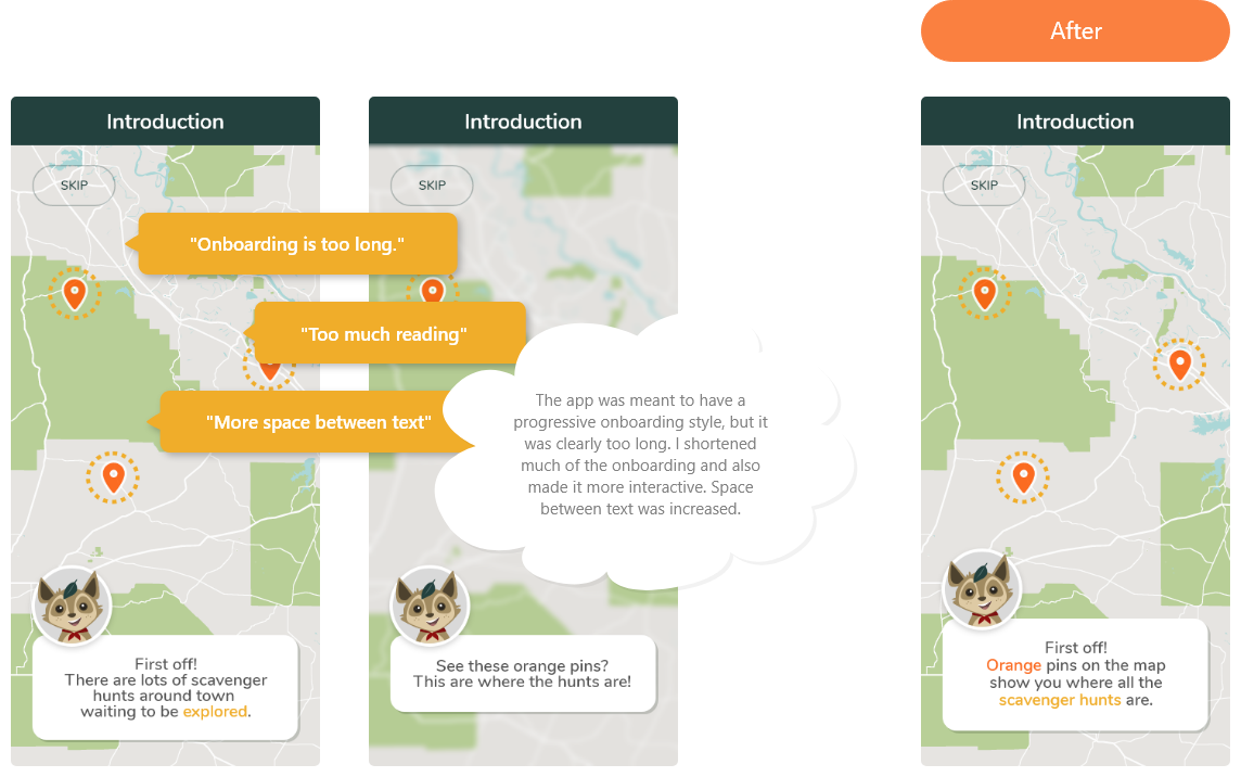
- Map pins were confused for locations of items in a scavenger hunt instead of being understood as the scavenger hunts themselves.
- The “Upload a Photo” screen doesn’t explain to the user what they’re uploading a photo for.
- The Hunts List icon was confused as an “Achievements” button.
- In the Create Hunt process, the “DONE” button brought the user to another page to check which made it seem like the process wasn’t actually done yet.
6 – Refinements
Usability Testing
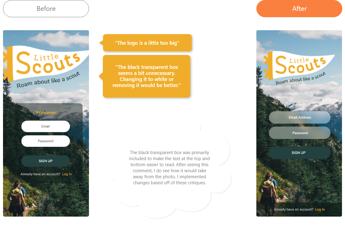
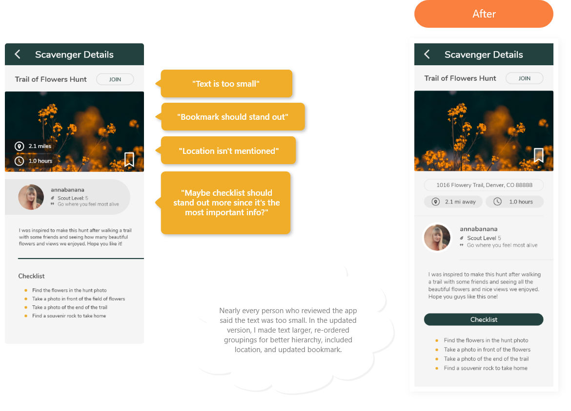
After adding color and making some changes based on principles of design and heuristics, I used my newly updated prototype to gather feedback from my peers.
